ATOMIC CALENDAR · PRODUCT DESIGN
Designing one timeline for your whole day.
A single place for tasks, meetings, special events, projects and a journal, so planning your day doesn’t mean opening three apps.
In 4 weeks, three of us designed the product across web and mobile. I owned the web application end to end: every screen, plus the interactive prototype.
Role
Product Designer, GeekyAnts
Timeline
4 weeks, 2025
Platform
Web (paired with mobile) · Figma
AT A GLANCE
Three tools’ worth of planning, in one timeline.
01
One timeline
Tasks, meetings, special events and journal entries live in one stream. Nothing gets filed twice.
02
Time before type
The dashboard groups by Overdue, Today and Tomorrow, not by object type.
03
One model, two platforms
Web and mobile share what things mean. Where they sit adapts to the platform.
01 · THE CHALLENGE
Tasks in one app, meetings in another, birthdays nowhere. The real planning happened in people’s heads.
The client was building this on his own, alongside a full-time job: a product he wanted to exist, not a commissioned brief.
The problem was one he lived with. None of these tools can see each other, so every morning you look at your calendar, then your task list, and reconcile the two yourself.
The brief: collapse that into one surface, on web and mobile, with a shared model across both.
What shaped the project
01
One surface
Tasks, meetings, special events, projects and a journal in a single application.
02
Two platforms, one model
Web and mobile had to share the same information model.
03
An existing design system
We worked within an internal system rather than building a new one.
04
4 weeks to deliver
From brief to an approved, prototyped design.
02 · MY ROLE
I owned the web application, end to end.
Three designers, split by platform. I owned the web application; Smruthi and Kavya owned mobile.
I owned: every web screen (dashboard, calendar views, task creation and editing, meeting scheduling and invitations, special events, projects, journal, profile and notifications), plus the interactive prototype
We owned jointly: the product model, the user flows and the competitor research
I didn’t own: any mobile screen, or the design system
Who owned what
01
Web application
Me: every screen, plus the interactive prototype.
02
Mobile application
Smruthi and Kavya.
03
Model, flows and research
All three of us, together.
03 · RESEARCH
The gap wasn’t a missing feature. None of the tools could see each other.
We looked closely at Google Calendar, Notion and mainstream to-do apps: the three kinds of tool our users were already running in parallel.
Each is good at one part of planning, and blind to the rest.
What each kind of tool gets right, and misses
01
Calendars
Excellent at time. Poor at work that isn’t scheduled yet.
02
To-do apps
Good at intent. Blind to your actual day.
03
Notion
Can model anything, so it models nothing by default and needs setting up first.

04 · THE MODEL
One timeline, four object types.
Tasks, meetings, special events and journal entries all live in a single chronological stream. Anything with a scheduled time appears on the calendar automatically, and projects group tasks without pulling them out of the timeline.
That “never file it twice” rule is what makes the one-app claim real. Three tools in one shell would still be three tools.
Never file it twice
01
Create a task, meeting, event or entry
→
02
It lands in one timeline
→
03
Scheduled items appear on the calendar
→
04
Projects group tasks in place

⤢ Click to expand
FIGMA
Product Model
One timeline, four object types, and how scheduled items reach the calendar and projects.
Open in Figma ↗
05 · THE DASHBOARD
If the promise is “stop switching,” the first screen has to prove it.
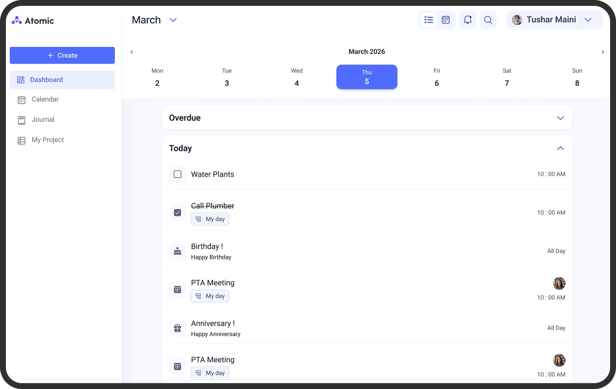
The web dashboard groups everything by time, and inside each group the types are mixed together. A task to water the plants, a birthday and a PTA meeting sit in the same list, told apart by a small type icon and a right-aligned time or “All Day”.
The two choices worth naming
01
Time before type
Grouping by object type would have rebuilt the exact fragmentation we were removing. Time is what the user is actually asking about.
02
Overdue, collapsed
Overdue work has to be visible or the product loses trust. But expanded above today’s list, it makes every morning start with failure. So it gets its own section, collapsed by default.

⤢ Click to expand
FIGMA
Dashboard: Wireframe to Final Design
Before and after of the web dashboard, from the first wireframe to the approved design.
Open in Figma ↗
05 · QUICK ADD
Capture and composition are different jobs.
A quick-add field sits pinned at the bottom of the dashboard, and a dedicated Create action lives in the sidebar. One control for both would have made the fast case slow or the complex case cramped.
Quick add and Create

01
Quick add
Remembering to buy milk should cost one field and one keystroke.
02
Create
Scheduling a meeting with three invitees gets a full form: type, date, time, all-day, and who to share it with.
05 · WEB AND MOBILE
Consistency in what things mean, not in where they sit.
Smruthi and Kavya designed the mobile app; I designed web. Both platforms share the information model, the grouping logic, the card anatomy and the quick-add pattern we defined together, so a task card reads the same on both.
How you reach it doesn’t, because a thumb and a cursor are not the same instrument. My web decisions adapted their mobile patterns to a larger screen and a cursor.
How the web app adapts the mobile patterns
01
Navigation
Their mobile design: bottom tab bar, 5 destinations. My web design: left sidebar, 4 destinations, with profile moved to the top right.
02
Creation
Their mobile design: floating action button. My web design: a persistent Create button in the sidebar.
03
Date navigation
Their mobile design: a six-day strip you swipe. My web design: the full Mon–Sun week with arrows and a month label.

06 · THE SOLUTION
Every web screen, from sign-in to settings.
I designed every web screen, across onboarding, planning, projects, journaling and settings.
What the web app covers
01
Onboarding
Phone-number sign-in with a 6-digit verification code, for new and returning users.
02
Dashboard
Week strip, Overdue / Today / Tomorrow groups, and quick add.
03
Calendar
Day, week and month views, with filters.
04
Create and edit
Tasks, meetings and special events, with date and time pickers, recurrence and invitees.
05
Projects and journal
Projects that group tasks, events and meetings; journal entries with tags and attachments.
06
Profile and settings
Timezone, default calendar view, reminders, sync, notifications and downloadable holiday calendars.

06 · ONBOARDING
Sign in with a phone number, no password.
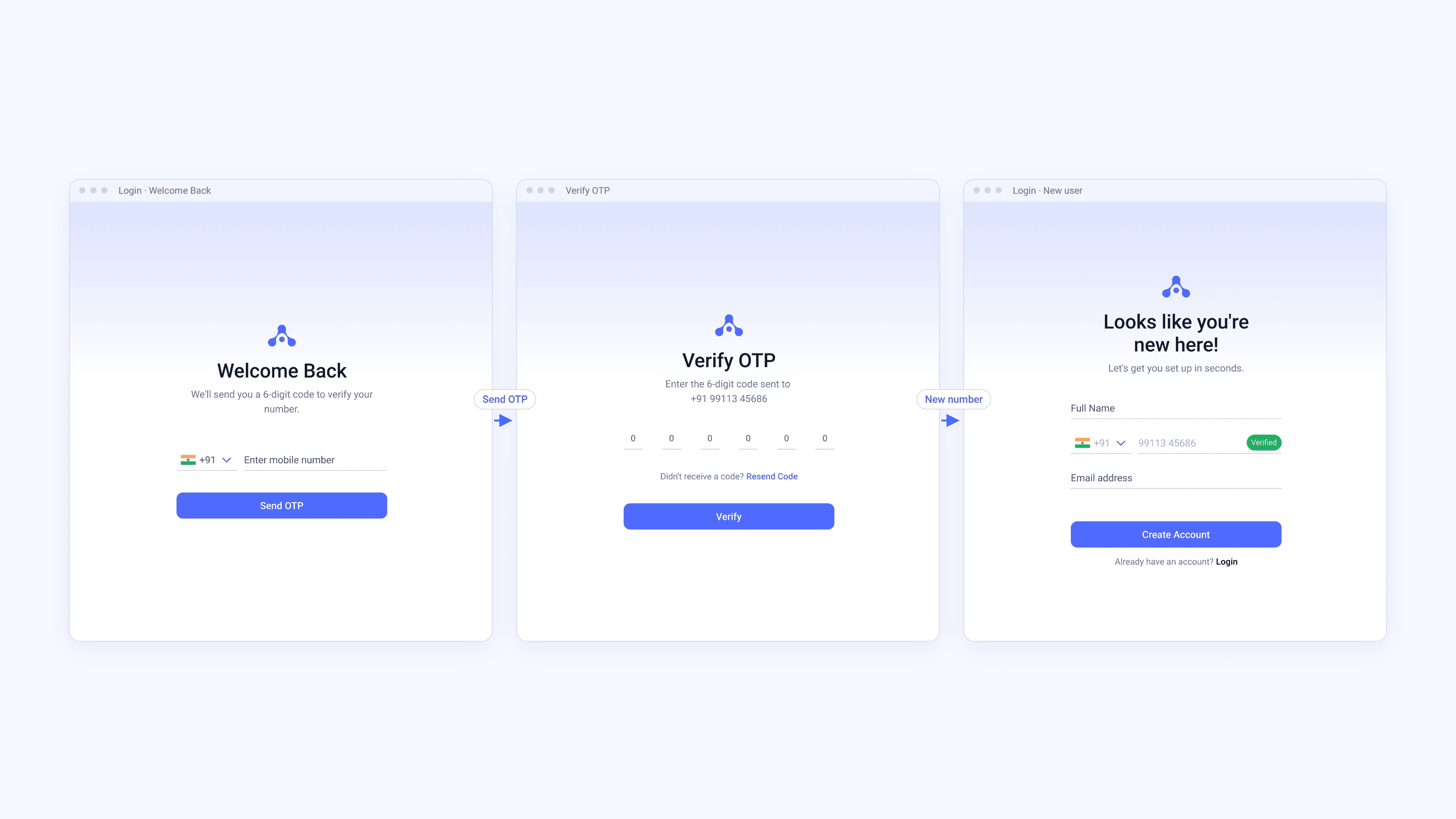
Onboarding is passwordless: enter a phone number, get a 6-digit code, and you're in. A returning number goes straight to the dashboard. A new number, already verified, adds only a name and an email.
Sign-in and verification
01
Phone number first
A +91 country picker and the number are the only fields.
02
6-digit verification
One code, with Resend Code close by. Verify stays disabled until all six digits are in.
03
New or returning
Returning users land on the dashboard. New users see “Looks like you're new here!” with the number already marked Verified.
06 · PROJECTS AND JOURNAL
Group work without moving it.
Projects collect tasks, meetings and events while they stay on the main timeline. The journal sits alongside for notes, with tags and attachments, and an entry can link to a task.
Projects and journal

01
Project cards
Each card shows the project's task and event counts.
02
Inside a project
Tasks, Events and Meetings in their own groups, each with View More.
03
Journal entries
Title, date and time, tags, the note and its attachments.
06 · SETTINGS
Defaults that match how you plan.
Profile and settings hold the defaults the rest of the app relies on: timezone, the default calendar view, reminders and sync.
Profile and settings

01
Default timezone
All events and reminders are shown in the timezone you pick.
02
Default calendar view
Day, week, month or agenda.
03
Reminders
Default, meeting and task reminder times, plus Smart Reminders that suggest times from your schedule.
04
Data and sync
Auto sync, Wi-Fi only, and a manual Sync Now.
07 · IMPACT
Approved by the client and now in development.
Atomic Calendar is still in development, so there are no launch metrics yet.
I built an interactive prototype of the web application covering task creation, calendar navigation, meeting scheduling, project creation and journal entries. The client approved the design and the product moved into development, with web and mobile sharing one model.
Next, I’d validate: whether mixing tasks, meetings and events in one list slows people down when scanning their day, how often people use quick add versus the full Create form, and whether the collapsed Overdue section keeps overdue work visible enough.
What the 4 weeks delivered
01
One model
A single timeline shared across web and mobile.
02
A complete web app
Every screen designed, from sign-in to settings.
03
A clickable prototype
The key flows connected, so the client could walk through the product before it was built.

⤢ Click to expand
FIGMA
Atomic Calendar Prototype
Three clickable flows of the web app in Figma.
View flow 1 ↗
View flow 2 ↗
View flow 3 ↗
08 · REFLECTION
A shared model doesn’t mean a shared layout.
01
On web, the user is still switching
The dashboard shows the list and the calendar is a separate destination in the sidebar. The user is still switching, just inside one application.
02
Use the room the platform gives you
The main column leaves most of the width unused. A split view, with the day’s list beside the day’s calendar, would show the core promise on a single screen. On mobile there isn’t room, and the tab bar is the right call. On web, I carried the mobile structure across when the platform offered something better.
Credits: Sinchana (Web) · Smruthi & Kavya (Mobile) · GeekyAnts

